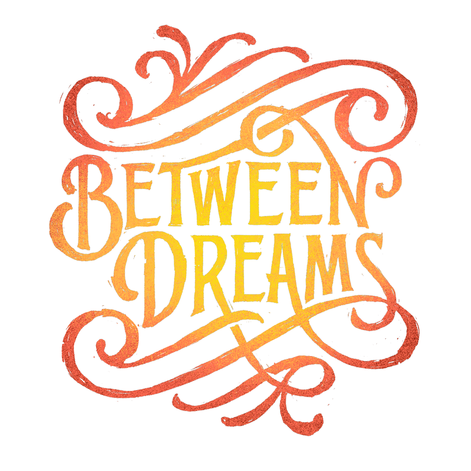
Behind the Design: Wake up & Dream

I'm always a sucker for old school victorian lettering and designs, so I loved his take on these old school letters.

An interesting idea, but I wasn't digging it completely.
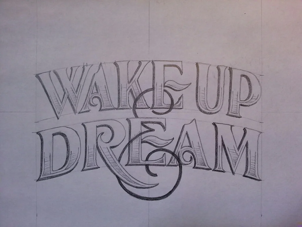
I loved the intertwining & sign through the letters.
Adding some decoration and we're onto something.

Time to print!
This saying has resonated with me for a long time. Its conflicting ideas somehow come together to make perfect sense. It was a clear choice to create this as a Between Dreams design.
I put Jason Carne to work.
I told him a bit about what I'm going for over lunch and within a few hours he had some ideas sketched out.